Portfolio
Brands, packaging, icons and data, made to be understood at a glance.
I design for clients including the District of Squamish, ewool, the Australian Data Archive, Scouts Australia and Kleffmann Group.
District of Squamish
Publication design
Publication design
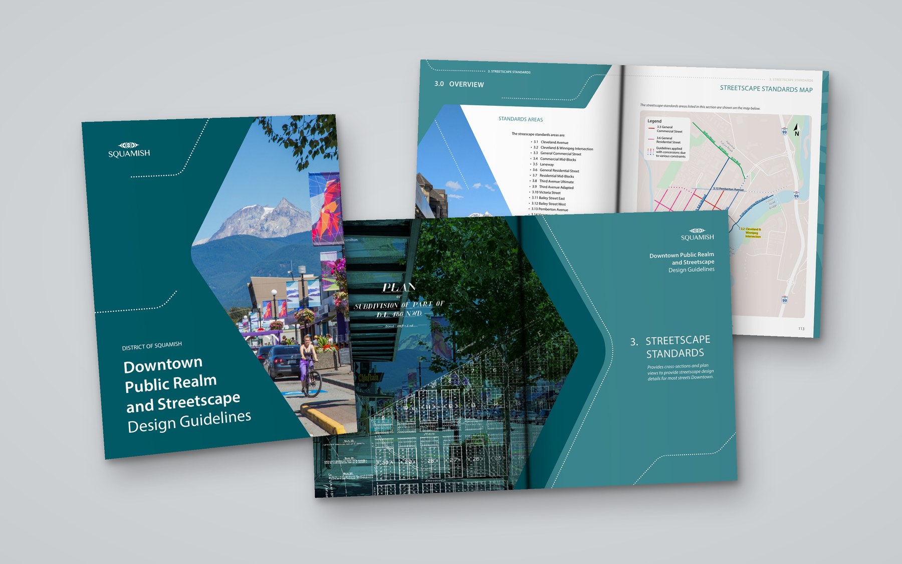
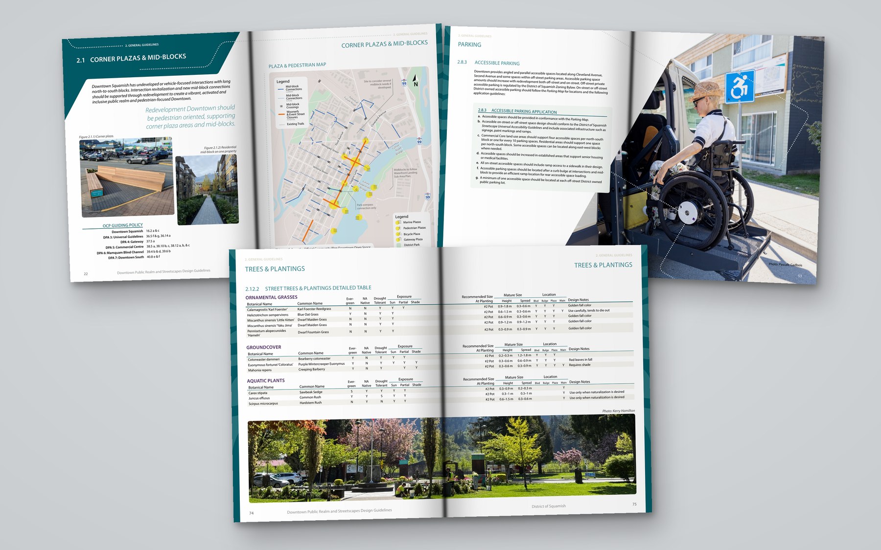
Downtown Public Realm and Streetscape Design Guidelines
The District of Squamish’s Downtown Public Realm and Streetscape Design Guidelines is a 214-page booklet. The technical standards were prepared by engineering consultants; I designed the document around them.
That included the cover, the teal section dividers, the page layouts, and the way maps, tables, drawings and photography sit together, so a very large reference stays easy to move through.
Publication design
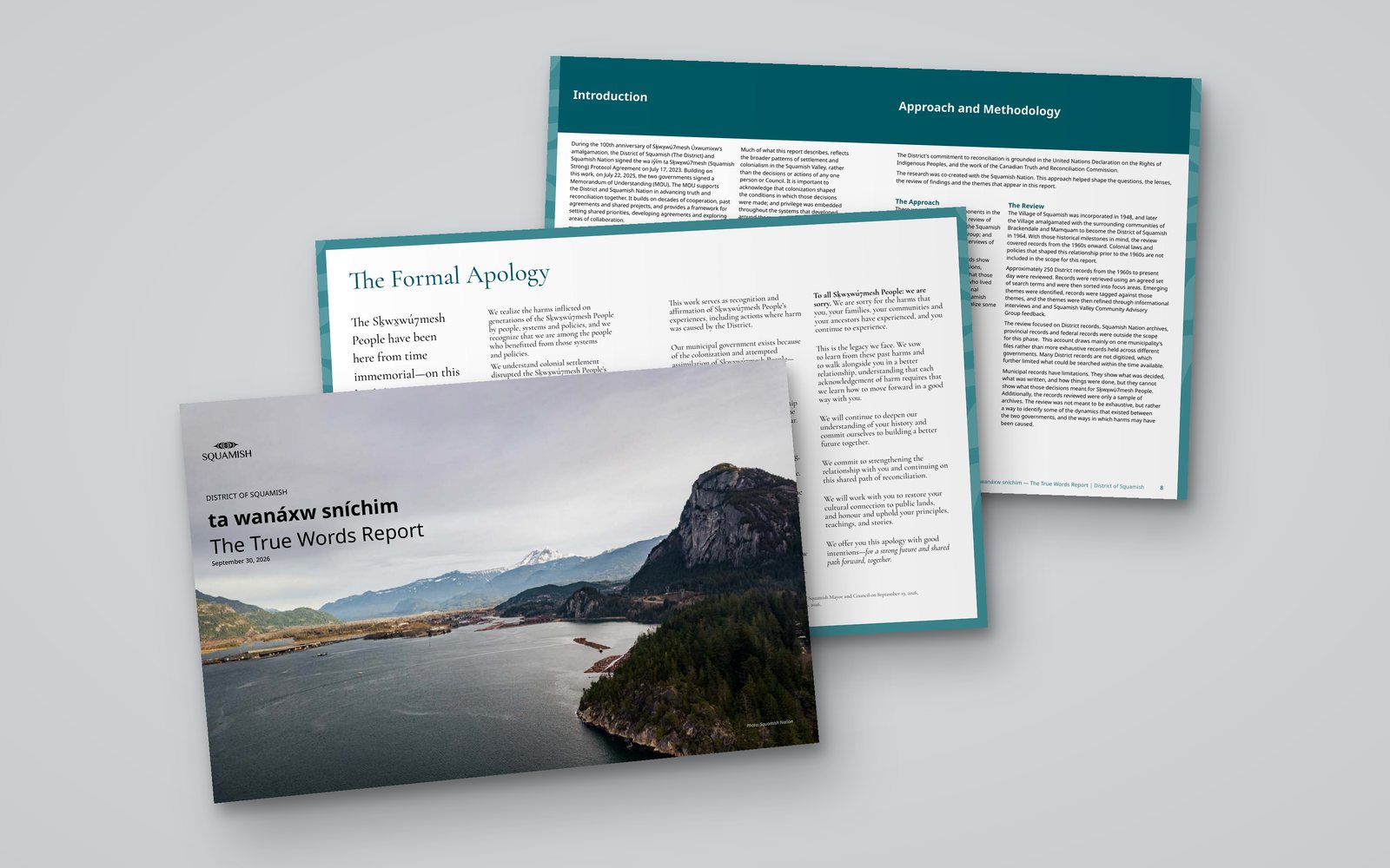
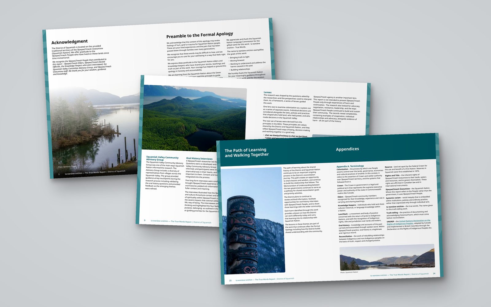
ta wanáxw sníchim: The True Words Report
ta wanáxw sníchim means “the true words”, a name gifted by Paháyikwup, the Squamish Nation’s language commission. The report shares the District of Squamish’s archival and oral history research into its relationship with Sḵwx̱wú7mesh Úxwumixw (Squamish Nation), and includes the Formal Apology delivered by Mayor and Council on September 19, 2026.
I designed the report to give difficult subject matter space and calm. A teal palette and tonal border frame the pages, the Formal Apology is set on its own spread in a serif typeface, and landscape photography of the Squamish valley runs through the report. Shown here are selected spreads.
ewool
Packaging, iconography and email marketing
Packaging
Product launch packaging
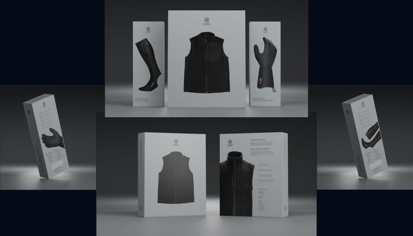
Ewool, creators of innovative and powerful heated clothing, approached me to develop materials for the launch of their newest products. The launch required clean minimalist packaging design, social media posts, advertising designs, and email marketing to promote the new products and increase brand awareness.
The main challenge was to create a cohesive and minimalist design that would effectively communicate the power and innovation of the new products, while still being visually appealing and easy to understand. Additionally, the designs needed to be adaptable for use across different mediums.
Packaging
Product packaging
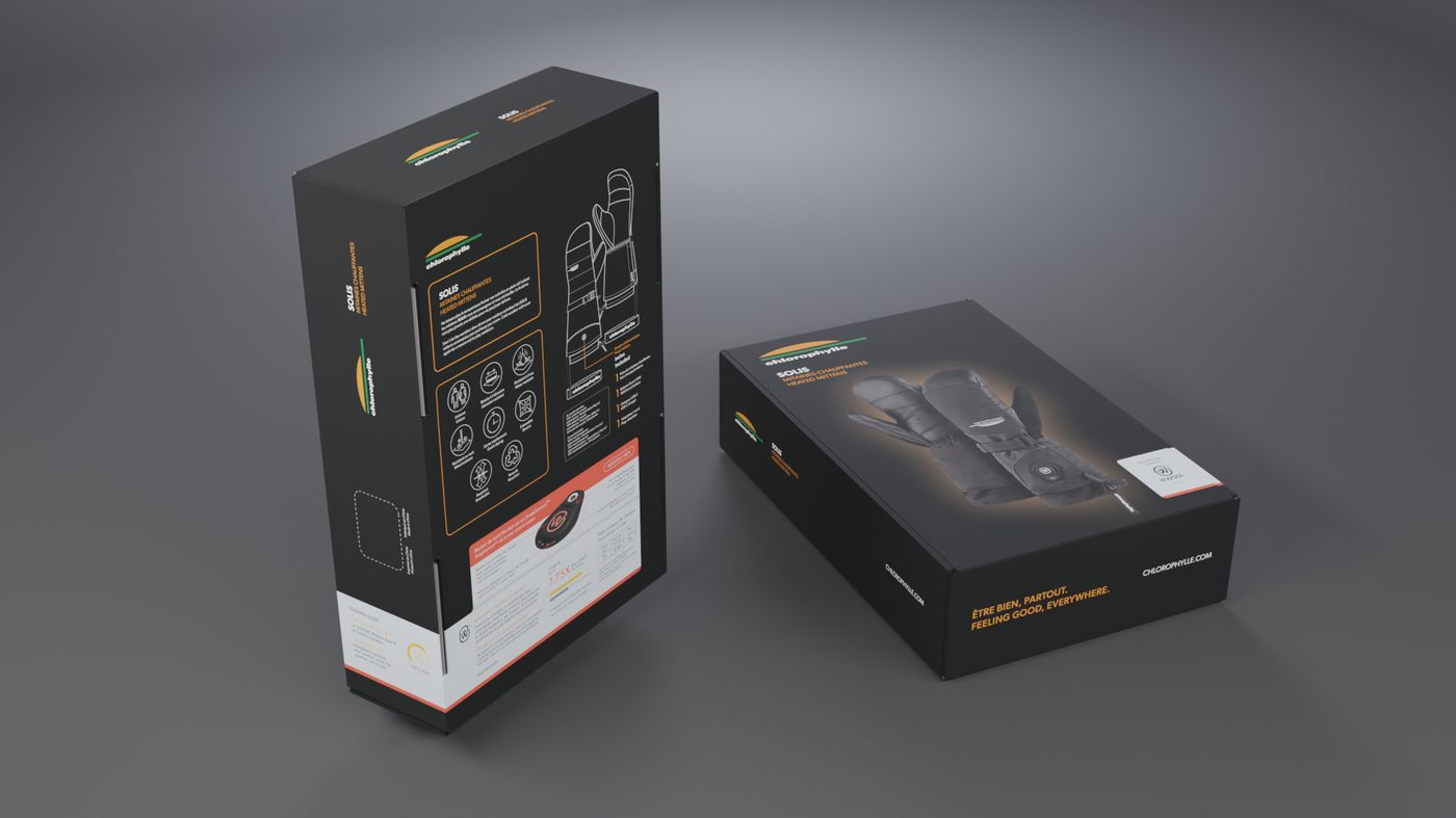
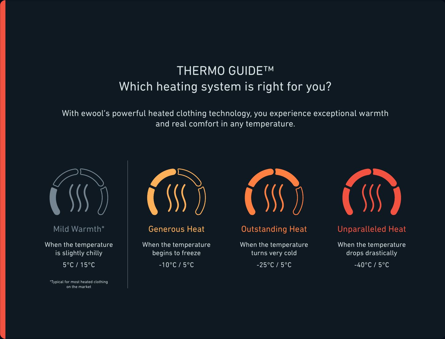
I developed an ingredient strip for ewool’s technology integration with their brand partners, showing the benefits of ewool’s heating technology on the packaging for the products. These strips featured the Thermoguide, shown below.
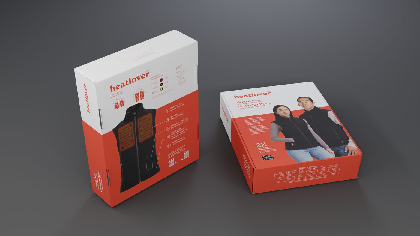
ewool created a spin-off brand, named Heatlover, in order to sell their technology and clothing on the mass market. I was selected to develop packaging for various products, including the Heated Vest.
When creating the packaging for Auclair, I had to take into account pulp moulding inserts for the ewool technology that would be included in the package along with the gloves and mitts.
 Chlorophylle ingredient label
 Heatlover brand packaging
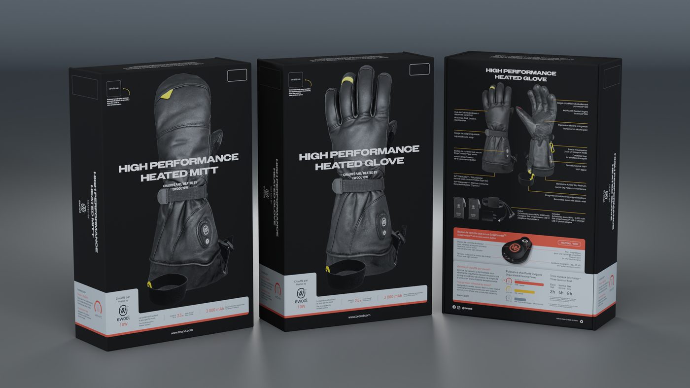 Auclair ingredient label
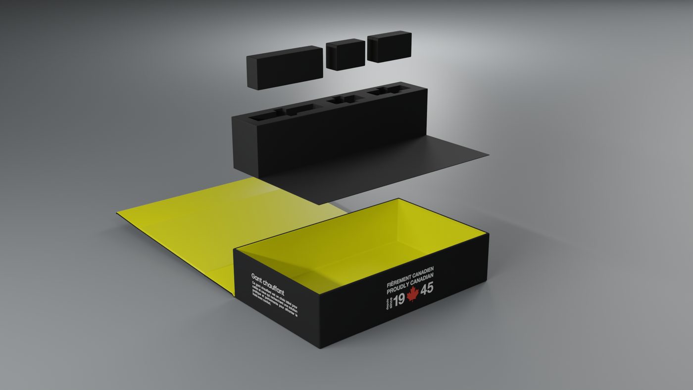 Auclair pulp moulding mockup
Iconography
Thermoguide
The Thermoguide is a visual system that informs consumers of the relative heat level of an item of clothing in ewool’s line.
It needed to be easily understandable at a glance, even when included in a small form factor on a brand partner’s packaging or on screens.
While developing this system, I worked to reselect a palette of distinct colours that represented each level of heat and didn’t conflict with the existing brand colours of gray and black.
Iconography
Icon set
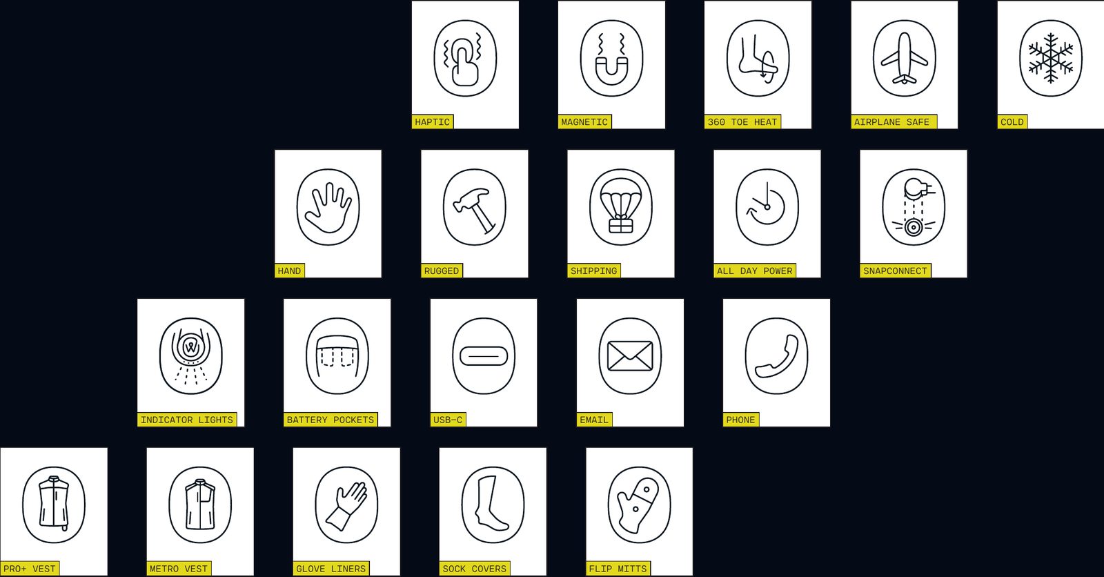
I worked closely with the ewool team to understand their brand and the features of the new products, including the revolutionary SnapConnect.
I used a clean and minimalist design style, with a focus on simplicity, functionality and elegance. I helped refine their existing icons and develop new ones through a system that would represent the brand and the new products.
I adhered to their colour palette, with a focus on neutral shades of grey and black, and the signature ewool red as a highlight.
Email marketing
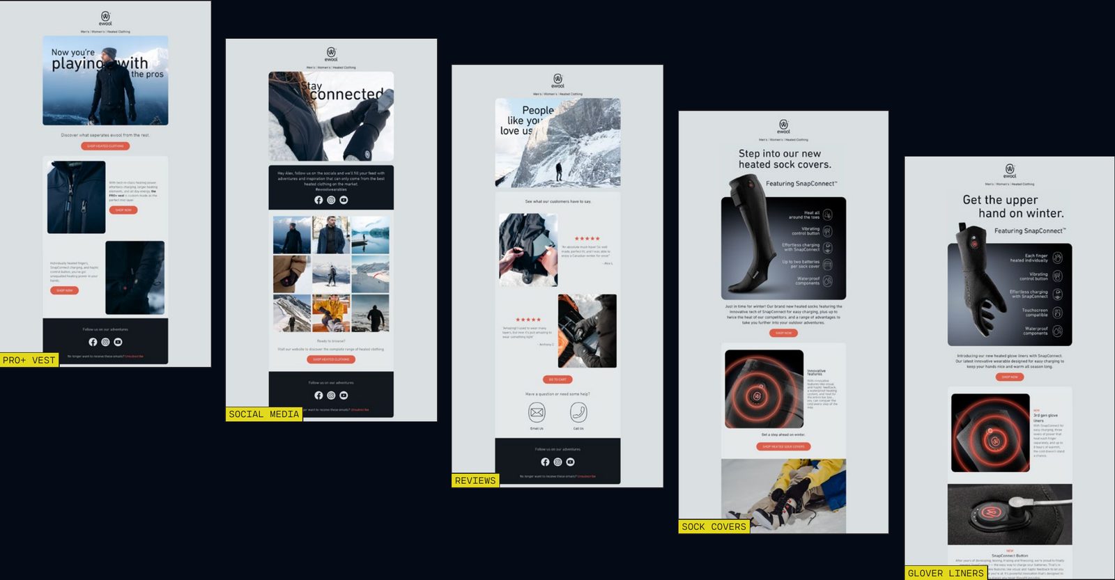
Email design
The new packaging design, social media posts, advertising designs, and email marketing were well received by the ewool team and their customers. The clean and minimalist design effectively communicated the power and innovation of the new products, and helped to increase brand awareness.
The adaptability of the designs across different mediums made it easy for the ewool team to promote the new products in various ways and reach a wider audience.
Australian Data Archive
Brand design for CADRE
Brand design
CADRE
The Australian Data Archive approached me about developing a brand for a new framework they were developing.
As a kind of digital passport, the framework covers the safe transfer and access of sensitive data, especially data concerning social studies.
It was important to convey feelings of security and safety through the brand, but with a request for it to be friendly and bright.
Brand design
Logo system
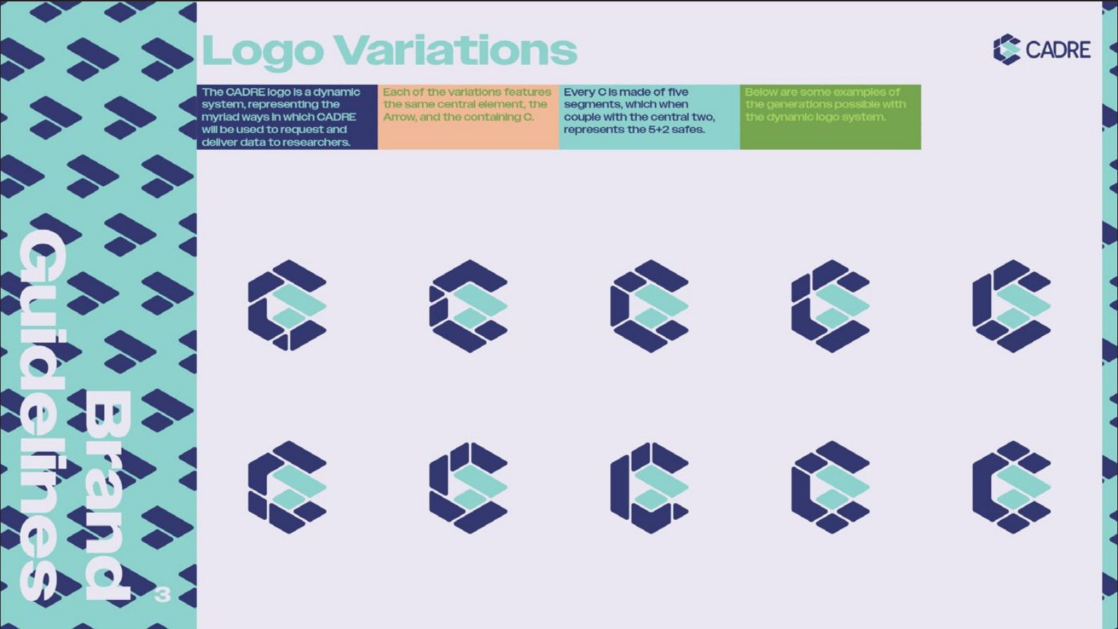
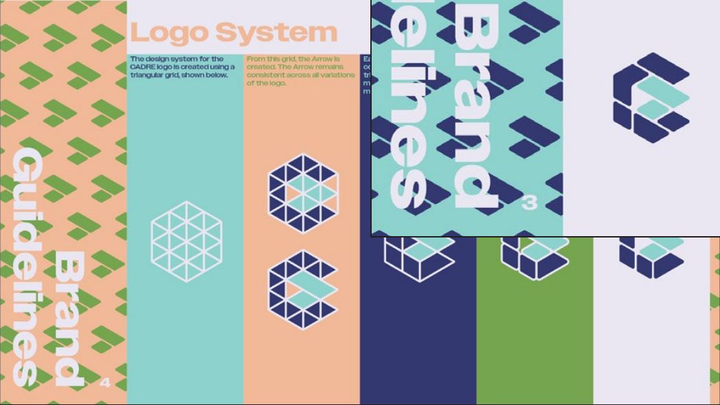
The logo is the core of the brand identity. It is dynamic, each variation representing the myriad data that will be accessed through CADRE.
Constructed via a triangular framework, the very foundation of the logo is inspired by the basis of the brand ideals, cadre being Latin for framework.
Each logo is constructed of the central arrow, symbolising the speed at which the system operates, and the containing C. The C is always made of five segments, and the arrow, two. This stands for the 5+2 Safes, the safety principles on which the framework is based.
Brand design
Iconography
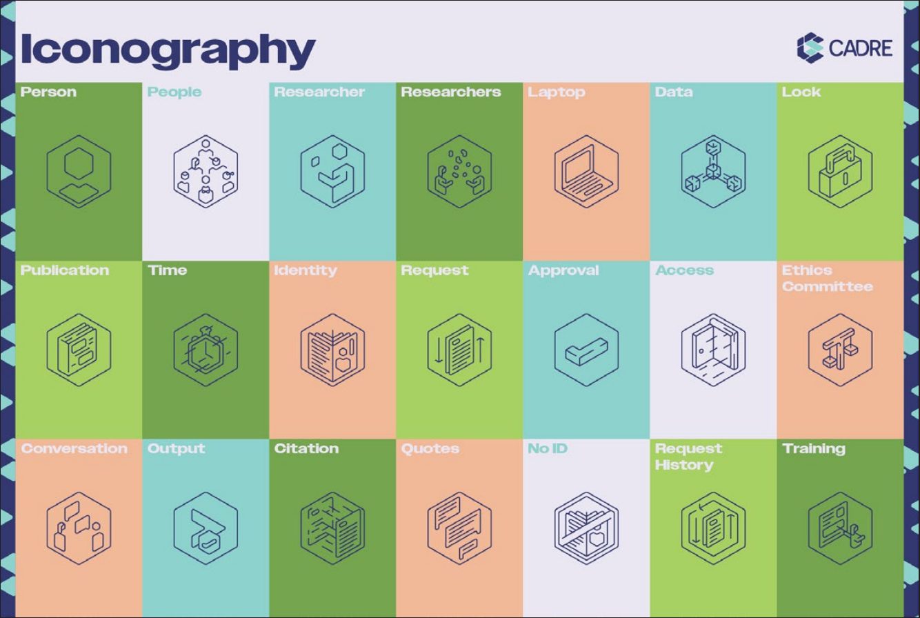
Bold typography was chosen to continue the work of the logo and colour scheme, creating more notions of strength and security, but simultaneously maintaining a friendlier air than would be presented by a geometric typeface.
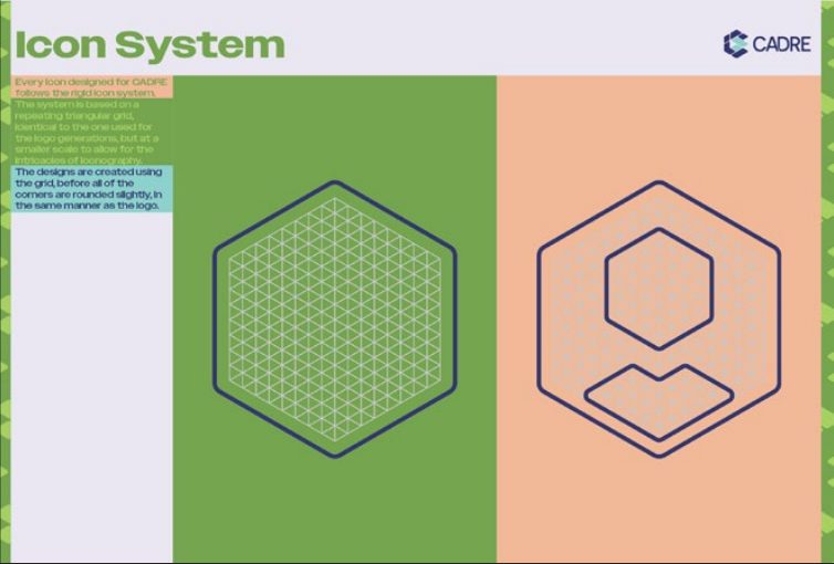
The icons were developed through a triangular framework similar to the logo. It ensured a feeling of similarity across each of the icons, as well as carrying on the sense of order and security that the logo features.
Scouts Australia
Icon design and publication design
Iconography
Icon design
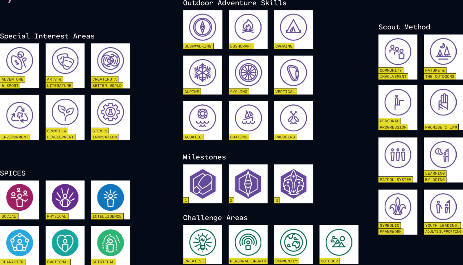
Scouts Australia was reviewing their current youth program and developing a new one.
At their request I created a series of icons to represent various elements of the program. Many of these would later become badges for the Personal Progression award scheme.
Publication design
Scout section record books
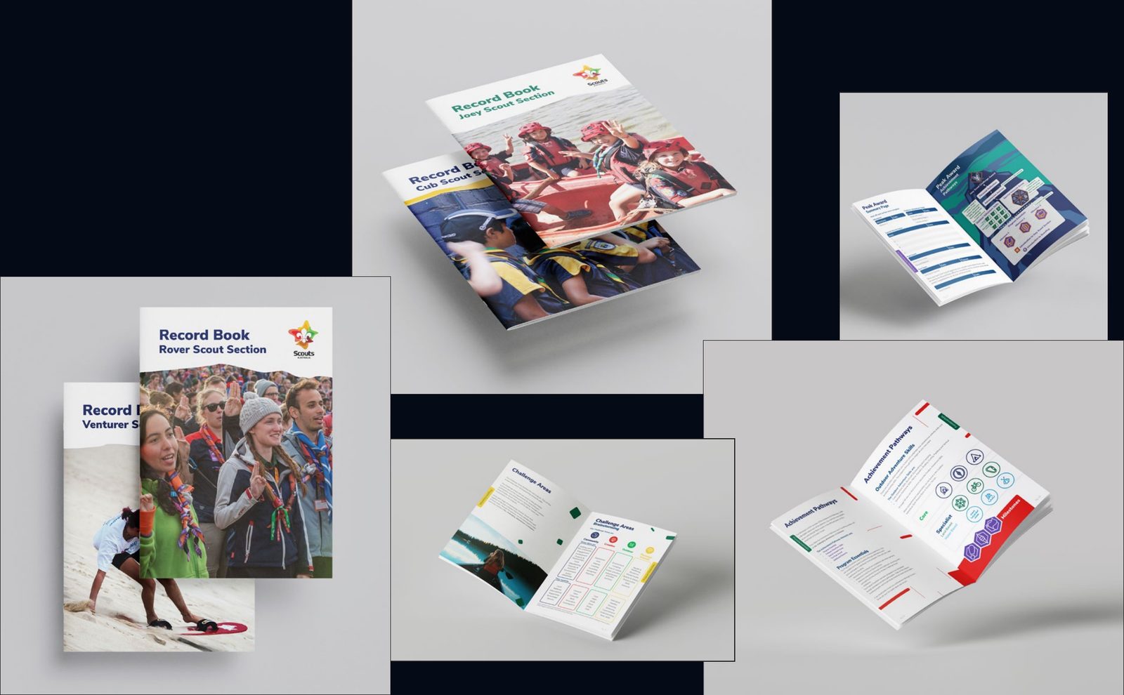
After developing the new program, Scouts Australia needed new record books for youth members to understand the new program and personal progression framework, and record their own progress as they complete challenges and achieve badges and awards.
I created a record book for each of the five Scout sections: Joey Scouts, Cub Scouts, Scouts, Venturer Scouts and Rover Scouts.
Kleffmann Group
Data visualisation
Data visualisation
Viticulture study
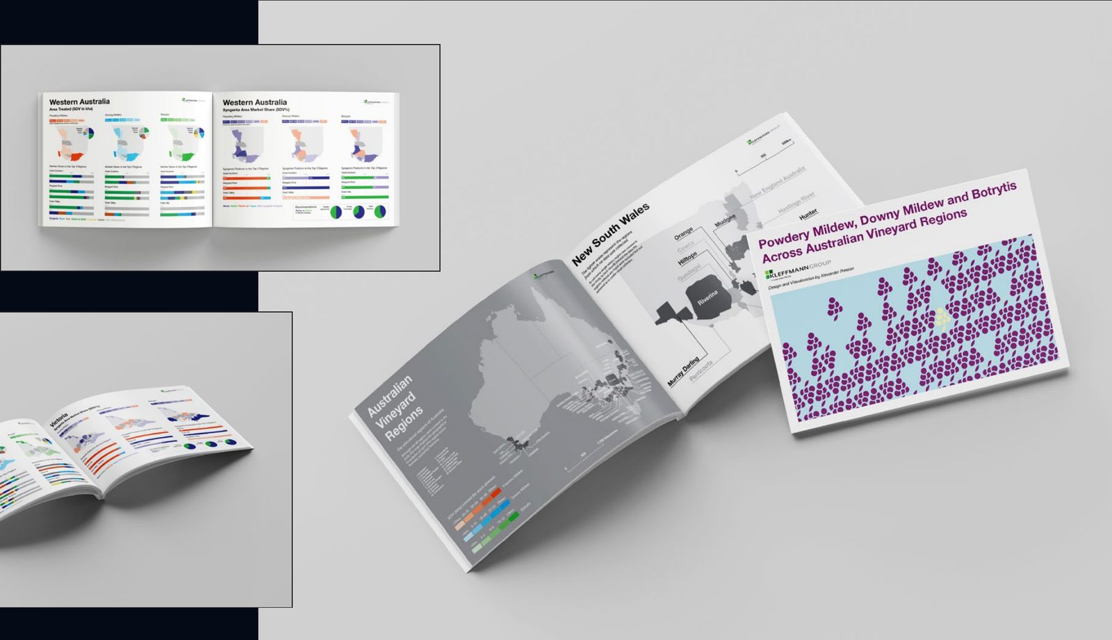
A study of all of Australia’s viticultural regions, covering the types and amounts of fungicides used to target different vine diseases, primarily powdery and downy mildew, and botrytis.
Data visualisation
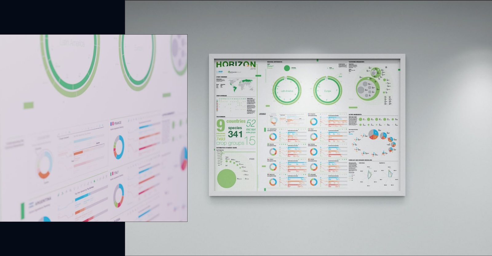
Project Horizon
Project Horizon was a meta-analysis performed by Kleffmann Group covering insecticide usage, species targets, modes of action and active ingredients across nine different countries.
I was tasked with creating this poster as a visual aid for the client, to assist their comprehension of an extremely detailed and complex study.
Data visualisation
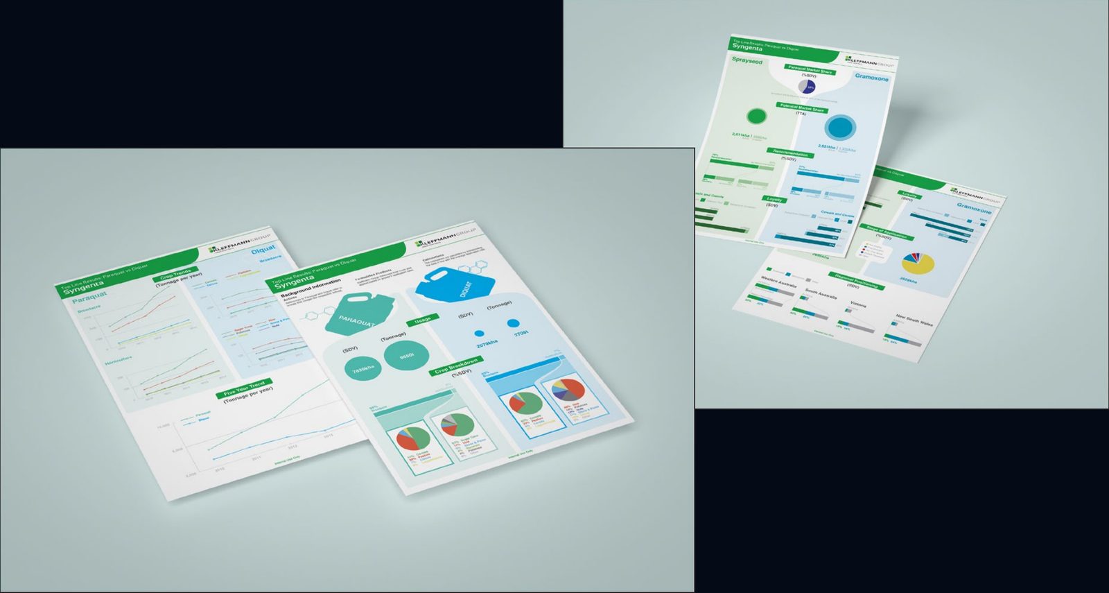
Paraquat vs. Diquat
This is one of many Top Line Results documents I created for an array of clients during my time at Kleffmann.
It covers the comparative usage of two chemicals, Paraquat and Diquat, across Australia. Then dives into the performance of the client’s brands of those chemicals.
About

Alex Preston is a Graphic Designer based in Squamish, BC, Canada.
Alex enjoys skiing, disc golfing, mountain biking, writing and reading fantasy and sci-fi novels, and listening to heaps of music. He once jumped off his cubby house with only an umbrella and didn’t break any bones, and remained break free until 2024, when he broke ten at once. (oops)
He is fluent in Japanese, and lived in Kanagawa for about a year and a half. He quite likes super spicy food, but only every now and then, and only if there is plenty of water nearby. His favourite colour is blue and his favourite food is Calbee Pizza Potato Chips.
He loves solving design and communication problems and has a lot of experience in doing so. He’s created a diverse range of visual communication solutions such as product packaging, logos and branding, social media posts and advertisements, websites, magazines, posters, maps, book covers and more.
His favourite projects are featured in his portfolio.
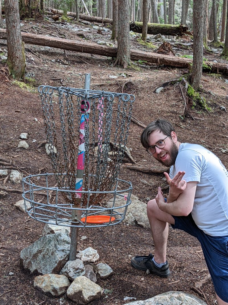
Getting a hole in one
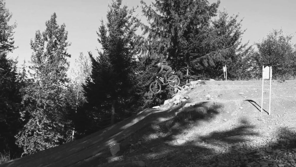
Sending it in the bike park

Under the northern lights
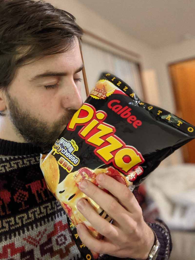
With his favourite chippies
- Brand design
- Packaging
- Iconography
- Email marketing
- Publication design
- Data visualisation
Contact
Have a project in mind? Email me.
>